I used to recommend the GNOME desktop for simple users for two main advantages over Windows:
- the logical, automatically filled and translated applications menu (compare that to the messy Windows Programs menu…);
- the general interface consistency (compare that with Windows Explorer, Windows Media Player, Avast! and each piece of crap^Wsoftware whose author believed developing yet another custom interface was the way to go).
Both points are what I call calm advantages, because users will usually enjoy them without noticing. Instead, they will enhance their experience so that they will miss them when they come back to a system which does not provide these features. In fact, being used to that, I do not really consider these points as actual advantages, but rather as a bare minimum for any decent desktop and as very important lacks of some competitors.
Well, GNOME 3 already reduced the first point by replacing the menu by a single loooong list of all the available software, although there are still categories at least.
Now, with a recent upgrade, it appears that they destroyed the second one, the interface consistency. There used to be a thing called the GTK theme, that the user could choose according to his taste and needs, and all the GTK-based graphical software, including GNOME programs, used to follow that theme. This is no longer the case: now, for instance, Nautilus will look clear, while for some reason Eye of GNOME and Totem will look dark, with no option to make them look like the others.
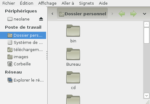 Nautilus |
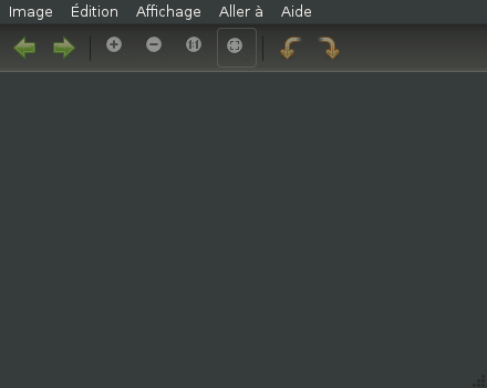 Eye of GNOME |
I used to be a GNOME user, but it has been some time since I stopped using a desktop at all and switched to a window manager that was more efficient according to my usage. However I kept using GNOME software, and I recommended GNOME to new users. Now it seems my arguments for that have reduced to a point where I should really consider recommending Xfce instead.
19 comments
monday 26 december 2011 à 12:56 Emmanuele Bassi said : #1
monday 26 december 2011 à 13:06 bluebirch said : #2
monday 26 december 2011 à 13:07 Emmanuele Bassi said : #3
monday 26 december 2011 à 14:24 Bob said : #4
monday 26 december 2011 à 15:47 ssam said : #5
monday 26 december 2011 à 16:40 Emmanuele Bassi said : #6
monday 26 december 2011 à 16:49 Adam said : #7
monday 26 december 2011 à 16:58 Tanguy said : #8
monday 26 december 2011 à 18:12 Adam said : #9
tuesday 27 december 2011 à 00:07 Gares said : #10
tuesday 27 december 2011 à 14:07 ssam said : #11
wednesday 28 december 2011 à 04:24 afanen01 said : #12
wednesday 28 december 2011 à 08:38 Tanguy said : #13
wednesday 28 december 2011 à 21:39 Bob said : #14
thursday 29 december 2011 à 08:26 Tanguy said : #15
friday 30 december 2011 à 08:27 Juanjo Marin said : #16
sunday 12 february 2012 à 08:31 Jack said : #17
saturday 19 january 2013 à 22:23 Ted said : #18
saturday 19 january 2013 à 23:01 Tanguy said : #19